StandardButton
The StandardButton looks like a button, but instead of customizing with text and icon,
it can used one of the pre-defined kind and the text and icon will depend on the style.
Properties
Section titled “Properties”enabled
Section titled “enabled” bool default: false
Defaults to true. When false, the button can’t be pressed
has-focus
Section titled “has-focus” bool (out) default: false
Set to true when the button currently has the focus
enum StandardButtonKind default: the first enum value
StandardButtonKind
Use this enum to add standard buttons to a Dialog. The look and positioning
of these StandardButtons depends on the environment
(OS, UI environment, etc.) the application runs in.
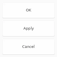
ok: A “OK” button that accepts aDialog, closing it when clicked.cancel: A “Cancel” button that rejects aDialog, closing it when clicked.apply: A “Apply” button that should accept values from aDialogwithout closing it.close: A “Close” button, which should close aDialogwithout looking at values.reset: A “Reset” button, which should reset theDialogto its initial state.help: A “Help” button, which should bring up context related documentation when clicked.yes: A “Yes” button, used to confirm an action.no: A “No” button, used to deny an action.abort: A “Abort” button, used to abort an action.retry: A “Retry” button, used to retry a failed action.ignore: A “Ignore” button, used to ignore a failed action.
The kind of button, one of ok cancel, apply, close, reset, help, yes, no, abort, retry or ignore
StandardButton { kind: ok;}primary
Section titled “primary” bool default: false
If set to true the button is displayed with the primary accent color.
pressed
Section titled “pressed” bool (out) default: false
Set to true when the button is pressed.
Callbacks
Section titled “Callbacks”clicked()
Section titled “clicked()”Invoked when clicked: A finger or the left mouse button is pressed, then released on this element.
StandardButton { clicked() => { debug("Button clicked"); }}© 2026 SixtyFPS GmbH