Text
// text-example.slintexport component TextExample inherits Window {    // Text colored red.    Text {        x:0; y:0;        text: "Hello World";        color: red;    }
// This paragraph breaks into multiple lines of text. Text { x:0; y: 30px; text: "This paragraph breaks into multiple lines of text"; wrap: word-wrap; width: 150px; height: 100%; }}A Text element for displaying text.
By default, the min-width, min-height, preferred-width, and preferred-height
of a Text element are set to fit the full text as if it were displayed on a single line
(unless the text contains explicit line breaks).
However, if the wrap property is set to word-wrap, and/or if the overflow property is set to elide,
the min-width is reduced to zero, allowing the text to wrap or be elided,
while the preferred-width and preferred-height remain unchanged.
Properties
Section titled “Properties” brush default: <depends on theme>
The color of the text.
Text { text: "Hello"; color: #3586f4; font-size: 40pt;}
font-family
Section titled “font-family” string default: ""
The name of the font family selected for rendering the text.
Text { text: "CoMiC!"; color: black; font-size: 40pt; font-family: "Comic Sans MS";}
font-size
Section titled “font-size” length default: 0px
The font size of the text.
Text { text: "Big"; color: black; font-size: 70pt;}
font-weight
Section titled “font-weight” int default: 0
The weight of the font. The values range from 100 (lightest) to 900 (thickest). 400 is the normal weight. Use the FontWeight namespace for predefined constants.
Text { text: "BOLD"; color: black; font-size: 30pt; font-weight: FontWeight.extra-bold;}
font-italic
Section titled “font-italic” bool default: false
Whether or not the font face should be drawn italicized or not.
Text { text: "Italic"; color: black; font-italic: true; font-size: 40pt;}
font-metrics
Section titled “font-metrics” struct FontMetrics (out) default: a struct with all default values
The design metrics of the font scaled to the font pixel size used by the element.
FontMetrics
A structure to hold metrics of a font for a specified pixel size.
ascent(length): The distance between the baseline and the top of the tallest glyph in the font.descent(length): The distance between the baseline and the bottom of the tallest glyph in the font. This is usually negative.x_height(length): The distance between the baseline and the horizontal midpoint of the tallest glyph in the font, or zero if not specified by the font.cap_height(length): The distance between the baseline and the top of a regular upper-case glyph in the font, or zero if not specified by the font.
horizontal-alignment
Section titled “horizontal-alignment” enum TextHorizontalAlignment default: the first enum value
Text { x: 0; text: "Hello"; color: black; font-size: 40pt; horizontal-alignment: left;}
TextHorizontalAlignment
This enum describes the different types of alignment of text along the horizontal axis of a Text or StyledText element.
start: The text will be aligned with the start edge of the containing box. This could be left or right depending on the direction of the text.end: The text will be aligned with the end edge of the containing box. This could be left or right depending on the direction of the text.left: The text will be aligned with the left edge of the containing box.center: The text will be horizontally centered within the containing box.right: The text will be aligned to the right of the containing box.
letter-spacing
Section titled “letter-spacing” length default: 0px
The letter spacing allows changing the spacing between the glyphs. A positive value increases the spacing and a negative value decreases the distance.
Text { text: "Spaced!"; color: black; font-size: 30pt; letter-spacing: 4px;}
overflow
Section titled “overflow” enum TextOverflow default: the first enum value
How the text should behave when it exceeds the available space.
TextOverflow
This enum describes the how the text appears if it is too wide to fit in the width of a Text or StyledText element.
clip: The text will simply be clipped.elide: The text will be elided with….
string default: ""
The text rendered.
vertical-alignment
Section titled “vertical-alignment” enum TextVerticalAlignment default: the first enum value
The vertical alignment of the text.
TextVerticalAlignment
This enum describes the different types of alignment of text along the vertical axis of a Text or StyledText element.
top: The text will be aligned to the top of the containing box.center: The text will be vertically centered within the containing box.bottom: The text will be aligned to the bottom of the containing box.
enum TextWrap default: the first enum value
Text { text: "This paragraph breaks into multiple lines of text"; font-size: 20pt; wrap: word-wrap; width: 180px;}
TextWrap
This enum describes the how the text wraps if it is too wide to fit in the width of a Text or StyledText element.
no-wrap: The text won’t wrap, but instead will overflow.word-wrap: The text will be wrapped at word boundaries if possible, or at any location for very long words.char-wrap: The text will be wrapped at any character. Currently only supported by the Qt and Software renderers.
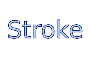
stroke
Section titled “stroke” brush default: a transparent brush
The brush used for the text outline.
Text { text: "Stroke"; stroke-width: 2px; stroke: darkblue; stroke-style: center; font-size: 80px; color: lightblue;}
stroke-width
Section titled “stroke-width” length default: 0px
The width of the text outline. If the width is zero, then a hairline stroke (1 physical pixel) will be rendered.
stroke-style
Section titled “stroke-style” enum TextStrokeStyle default: the first enum value
Text { text: "Style"; stroke-width: 2px; stroke: #3586f4; stroke-style: center; font-size: 60px; color: white;}
TextStrokeStyle
This enum describes the positioning of a text stroke relative to the border of the glyphs in a Text or StyledText element.
outside: The inside edge of the stroke is at the outer edge of the text.center: The center line of the stroke is at the outer edge of the text, like in Adobe Illustrator.
Accessibility
Section titled “Accessibility”By default, Text elements have the following accessibility properties set:
accessible-role: text;accessible-label: text;
© 2026 SixtyFPS GmbH