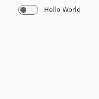
Switch
import { Switch } from "std-widgets.slint";export component Example inherits Window {    width: 200px;    height: 40px;
    Switch {        text: "Hello World";    }}
slint

A Switch is a representation of a physical switch that allows users to turn things on or off. Consider using a CheckBox instead if you want the user to select or deselect values, for example in a list with multiple options.
Properties
Section titled “Properties”checked
Section titled “checked” bool (in-out) default: false
Whether the switch is checked or not.
Switch { text: self.checked ? "Checked" : "Not checked"; checked: true;}slint
enabled
Section titled “enabled” bool default: false
When false, the switch can’t be pressed
has-focus
Section titled “has-focus” bool (out) default: false
Set to true when the switch has keyboard focus
Callbacks
Section titled “Callbacks”toggled()
Section titled “toggled()”The switch value changed
Switch { text: "Switch"; toggled() => { debug("CheckBox checked: ", self.checked); }}slint
© 2026 SixtyFPS GmbH