TabWidget
import { TabWidget } from "std-widgets.slint";export component Example inherits Window { width: 200px; height: 200px; TabWidget { Tab { title: "First"; Rectangle { background: orange; } } Tab { title: "Second"; Rectangle { background: pink; } } }}slint
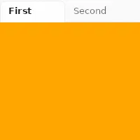
TabWidget is a container for a set of tabs. It can only have Tab elements as children and only one tab will be visible at
a time.
Properties
Section titled “Properties”current-index
Section titled “current-index” int default: 0
The index of the currently visible tab.
TabWidget {    current-index: 1;
    Tab {        title: "First";    }    Tab {        title: "Second";    }}
slint
orientation
Section titled “orientation” enum Orientation default: horizontal
Orientation
Represents the orientation of an element or widget such as the Slider.
horizontal: Element is oriented horizontally.vertical: Element is oriented vertically.
The orientation of the tab bar.
When set to vertical, the tab bar is placed to the left of the content.
The property must be constant.
For example:
TabWidget { in property <Orientation> foo; // orientation: foo; // error orientation: Orientation.vertical; //valid Tab { title: "First"; }}slint
Properties of the Tab element
Section titled “Properties of the Tab element”© 2026 SixtyFPS GmbH