StyledText
The StyledText element renders text with various styling and interactive properties, such as bolded, underlined and colored sections as well as HTTP links. It is based on a subset of the commonmark ↗ spec.
export component Example inherits Window { in property <string> value: 55; width: 200px; height: 200px; StyledText { text: @markdown("This is a piece of <u>Styled Text</u>\n" "with a red value inserted:" "<font color=\"red\">\{value}</font>"); }}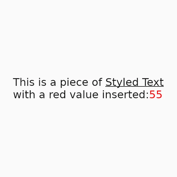
Features
Section titled “Features”Styled Text supports the following features:
| Feature | Method |
|---|---|
| Italics | Builtin |
| Strikethroughs | Builtin |
| Inline code | Builtin |
| Links | Builtin |
| Ordered and unordered lists | Builtin |
| Underlines | <u> HTML tag |
| Text Colors | <font color="..."> HTML tags |
Currently Unsupported
Section titled “Currently Unsupported”| Feature |
|---|
| Headings |
| Images |
| Tables |
| Block Quotes |
| Subscripts |
| Superscripts |
| Horizontal Rules |
| Footnotes |
| Math expressions |
| Other HTML tags |
Properties
Section titled “Properties”default-color
Section titled “default-color” brush default: <depends on theme>
The default color of the text, used when no color is specified via markup.
default-font-family
Section titled “default-font-family” string default: ""
The default font family used to render the text, when no font is specified via markup. If left empty, the value falls back to the enclosing Window’s default-font-family.
default-font-size
Section titled “default-font-size” length default: 0px
The default font size used to render the text, when no size is specified via markup. If unset (or zero), the value falls back to the enclosing Window’s default-font-size.
horizontal-alignment
Section titled “horizontal-alignment” enum TextHorizontalAlignment default: the first enum value
The horizontal alignment of the text.
TextHorizontalAlignment
This enum describes the different types of alignment of text along the horizontal axis of a Text or StyledText element.
start: The text will be aligned with the start edge of the containing box. This could be left or right depending on the direction of the text.end: The text will be aligned with the end edge of the containing box. This could be left or right depending on the direction of the text.left: The text will be aligned with the left edge of the containing box.center: The text will be horizontally centered within the containing box.right: The text will be aligned to the right of the containing box.
link-color
Section titled “link-color” color default: #00f
The color used for rendering links in the text.
styled-text default: ""
The styled text rendered, using CommonMark markup with additional HTML tags for styling.
vertical-alignment
Section titled “vertical-alignment” enum TextVerticalAlignment default: the first enum value
The vertical alignment of the text.
TextVerticalAlignment
This enum describes the different types of alignment of text along the vertical axis of a Text or StyledText element.
top: The text will be aligned to the top of the containing box.center: The text will be vertically centered within the containing box.bottom: The text will be aligned to the bottom of the containing box.
Callbacks
Section titled “Callbacks”link-clicked(link: string)
Section titled “link-clicked(link: string)”A callback that’s invoked when a link in the text is clicked. The parameter contains the clicked link as a string.
© 2026 SixtyFPS GmbH