
StyledText
The StyledText element renders text with various styling and interactive properties, such as bolded, underlined and colored sections as well as HTTP links. It is based on a subset of the commonmark ↗ spec.
export component Example inherits Window { in property <string> value: 55; width: 200px; height: 200px; StyledText { text: @markdown("This is a piece of <u>Styled Text</u>\n" "with a red value inserted:" "<font color=\"red\">\{value}</font>"); }}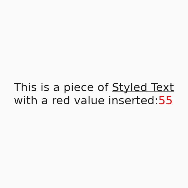
Features
Section titled “Features”Styled Text supports the following features:
| Feature | Method |
|---|---|
| Italics | Builtin |
| Strikethroughs | Builtin |
| Inline code | Builtin |
| Links | Builtin |
| Ordered and unordered lists | Builtin |
| Underlines | <u> HTML tag |
| Text Colors | <font color="..."> HTML tags |
Currently Unsupported
Section titled “Currently Unsupported”| Feature |
|---|
| Headings |
| Images |
| Tables |
| Block Quotes |
| Subscripts |
| Superscripts |
| Horizontal Rules |
| Footnotes |
| Math expressions |
| Other HTML tags |
Properties
Section titled “Properties”default-color
Section titled “default-color”brushdefault: <depends on theme>
The default color of the text, used when no color is specified via markup.
default-font-family
Section titled “default-font-family”stringdefault: ""
The default font family used to render the text, when no font is specified via markup. If left empty, the value falls back to the enclosing Window’s default-font-family.
default-font-size
Section titled “default-font-size”lengthdefault: 0px
The default font size used to render the text, when no size is specified via markup. If unset (or zero), the value falls back to the enclosing Window’s default-font-size.
horizontal-alignment
Section titled “horizontal-alignment”enum TextHorizontalAlignmentdefault: start
The horizontal alignment of the text.
TextHorizontalAlignment
This enum describes the different types of alignment of text along the horizontal axis of a Text or StyledText element.
start: The text will be aligned with the start edge of the containing box. This could be left or right depending on the direction of the text.end: The text will be aligned with the end edge of the containing box. This could be left or right depending on the direction of the text.left: The text will be aligned with the left edge of the containing box.center: The text will be horizontally centered within the containing box.right: The text will be aligned to the right of the containing box.
link-color
Section titled “link-color”colordefault: #0000ff
The color used for rendering links in the text.
max-lines
Section titled “max-lines”intdefault: 0
The maximum number of lines to display. Wrapped lines count towards the limit. Values less than or equal to zero don’t limit the number of lines.
styled-textdefault: ""
The styled text rendered, using CommonMark markup with additional HTML tags for styling.
vertical-alignment
Section titled “vertical-alignment”enum TextVerticalAlignmentdefault: top
The vertical alignment of the text.
TextVerticalAlignment
This enum describes the different types of alignment of text along the vertical axis of a Text or StyledText element.
top: The text will be aligned to the top of the containing box.center: The text will be vertically centered within the containing box.bottom: The text will be aligned to the bottom of the containing box.
Callbacks
Section titled “Callbacks”link-clicked(link: string)
Section titled “link-clicked(link: string)”A callback that’s invoked when a link in the text is clicked. The parameter contains the clicked link as a string.
selectable
Section titled “selectable”booldefault: false
Whether the text can be selected with the mouse.
Pressing and dragging selects, a double click selects a word and a triple click a paragraph.
A click that doesn’t drag still follows a link.
The press takes the focus, and the selection goes when the focus does, as in a TextInput,
so at most one element shows a mouse selection at a time.
A change of text keeps the selection’s offsets, clamped to the new text.
selection-background-color
Section titled “selection-background-color”colordefault: depends on the style
The background color of the selection.
selection-foreground-color
Section titled “selection-foreground-color”colordefault: depends on the style
The foreground color of the selection.
has-selection
Section titled “has-selection”bool(out)
true when text is selected.
Functions
Section titled “Functions”set-selection-offsets(anchor: int, focus: int)
Section titled “set-selection-offsets(anchor: int, focus: int)”Selects the text between two UTF-8 byte offsets.
anchor is the end of the selection that stays put and focus the end the cursor moves to,
so focus may precede anchor to select backwards.
Pass the same value for both to clear the selection.
select-all()
Section titled “select-all()”Selects all text.
clear-selection()
Section titled “clear-selection()”Clears the selection.
copy()
Section titled “copy()”Copies the selected text to the clipboard.
© 2026 SixtyFPS GmbH